Understanding hue and tone is essential in the world of color, whether you’re an artist, designer, or simply someone who appreciates the beauty of colors. In this article, we’ll delve into the intricacies of hue and tone, exploring their definitions, differences, and how they can be used to create stunning visual effects.
What is Hue?
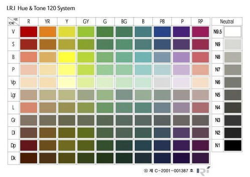
Hue refers to the purest, brightest colors that form the spectrum. It’s the color as we see it on the color wheel, with each hue represented by a different position on the wheel. These hues are vibrant and lively, perfect for creating bold and exciting designs.
What is Tone?

Tone, on the other hand, is a more complex concept. It involves adding gray to a hue, creating a more muted and subtle color. Think of a tone as a shade of gray mixed with a specific hue. This creates a more sophisticated and nuanced color that can be used to add depth and interest to your designs.
Differences Between Hue and Tone
While hue and tone are closely related, there are some key differences between the two. Here’s a table summarizing the main differences:
| Aspect | Hue | Tone |
|---|---|---|
| Definition | The purest, brightest color in the spectrum | A color created by adding gray to a hue |
| Example | Red, blue, yellow | Red-brown, blue-gray, yellow-green |
| Use | For bold, vibrant designs | For subtle, sophisticated designs |
As you can see, hue is all about the brightness and purity of the color, while tone focuses on the addition of gray to create a more muted and complex color.
Creating Tints and Shades
Now that we understand hue and tone, let’s explore how they can be used to create tints and shades. Tints are created by adding white to a hue, while shades are created by adding black. Here’s a table showing the relationship between hue, tone, tint, and shade:
| Color | Hue | Tone | Tint | Shade |
|---|---|---|---|---|
| Red | Red | Red-brown | Pink | Maroon |
| Blue | Blue | Blue-gray | Sky blue | Dark blue |
| Yellow | Yellow | Yellow-green | Lemon yellow | Butter yellow |
By understanding the relationships between hue, tone, tint, and shade, you can create a wide range of colors to suit your design needs.
Applying Hue and Tone in Design
Now that we’ve explored the technical aspects of hue and tone, let’s look at how they can be applied in design. Here are a few tips for using hue and tone effectively:
-
Use bright hues to create a bold and vibrant design.
-
Combine hues and tones to create a more sophisticated look.
-
Use tints and shades to add depth and interest to your designs.
-
Experiment with different hues and tones to find the perfect combination for your project.
By understanding the nuances of hue and tone, you can create stunning visual effects that will impress your audience. Whether you’re an artist, designer, or simply someone who appreciates the beauty of colors, mastering hue and tone will take your work to the next level.