Cool vs Warm Tones: A Comprehensive Guide
When it comes to color theory, the distinction between cool and warm tones is fundamental. These two categories of colors play a significant role in various aspects of design, fashion, and art. In this article, we will delve into the characteristics, applications, and the psychology behind cool and warm tones.
Understanding Cool Tones

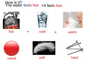
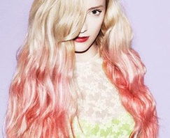
Cool tones are characterized by their association with nature, calmness, and serenity. They include colors like blue, green, and purple. These hues are often associated with the sky, water, and foliage.
| Color | Description | Association |
|---|---|---|
| Blue | Relaxing and calming | Sky, water, and depth |
| Green | Earthly and natural | Vegetation, nature, and growth |
| Purple | Regal and mysterious | Royalty, luxury, and creativity |
Understanding Warm Tones
Warm tones, on the other hand, evoke feelings of warmth, energy, and passion. They include colors like red, orange, and yellow. These hues are often associated with fire, the sun, and the earth.
| Color | Description | Association |
|---|---|---|
| Red | Passionate and intense | Love, danger, and power |
| Orange | Dynamic and vibrant | Energy, enthusiasm, and creativity |
| Yellow | Uplifting and cheerful | Optimism, happiness, and warmth |
Applications of Cool and Warm Tones

In design, the use of cool and warm tones can significantly impact the overall mood and atmosphere of a space. Here are some examples of how these tones are applied in different fields:
Architecture
In architecture, cool tones are often used to create a sense of calmness and relaxation. For instance, hospitals and spas commonly incorporate blue and green hues to promote a serene environment. Conversely, warm tones can be used to create a lively and energetic atmosphere, such as in restaurants and gyms.
Fashion
In fashion, cool tones are often associated with elegance and sophistication. Designers use these hues to create a sleek and modern look. Warm tones, on the other hand, are used to evoke a sense of warmth and approachability, making them popular for casual and sportswear.
Art
Artists often use cool and warm tones to convey emotions and create a specific atmosphere. For example, a painting with cool tones might convey a sense of melancholy or introspection, while a painting with warm tones might evoke happiness or excitement.
Psychology of Cool and Warm Tones
The psychology behind cool and warm tones is rooted in the way these hues are perceived by the human eye. Cool tones tend to recede and expand, making them ideal for backgrounds and spaces that require a sense of openness and calmness. Warm tones, on the other hand, tend to advance and contract, making them perfect for focal points and elements that require attention.
Here’s a table summarizing the psychological effects of cool and warm tones:
| Color | Psychological Effect |
|---|---|
| Cool tones | Relaxation, calmness, and introspection |
| Warm tones | Energy, warmth, and excitement |
In conclusion, cool and warm tones